


Creating a complex component in React from scratch can be challenging at times. But if you really want to hone your JavaScript and CSS skills, then it is definitely worth the try.
This article solely focuses on building a multi-range slider without using a third-party library.
Check out the demo shown below.
Creating the Basics
Let's create a MultiRangeSlider.js component file and add the JSX given below.
const MultiRangeSlider = () => {

return (
    <>
      <input
        type="range"
        min="0"
        max="1000"
        className="thumb thumb--zindex-3"
      />
      <input
        type="range"
        min="0"
        max="1000"
        className="thumb thumb--zindex-4"
      />
    </>
  );
};

export default MultiRangeSlider;
In the above code, the first input range tag will be used as the left thumb for sliding and the second one will be used as the right thumb.
In the next step, let's get rid of the default appearances of both the sliders using CSS and redesign them.
Redesigning the Component
We need to create the track and range bars for the slider. Add the code given below right after the input tags.
<div className="slider">
   <div className="slider__track" />
   <div className="slider__range" />
</div>
Now, create a multiRangeSlider.css file and add the styles.
.slider {
  position: relative;
  width: 200px;
}

.slider__track,
.slider__range {
  border-radius: 3px;
  height: 5px;
  position: absolute;
}

.slider__track {
  background-color: #ced4da;
  width: 100%;
  z-index: 1;
}

.slider__range {
  background-color: #9fe5e1;
  z-index: 2;
}

/* Removing the default appearance */
.thumb,
.thumb::-webkit-slider-thumb {
  -webkit-appearance: none;
  -webkit-tap-highlight-color: transparent;
}

.thumb {
  pointer-events: none;
  position: absolute;
  height: 0;
  width: 200px;
  outline: none;
}

.thumb--zindex-3 {
  z-index: 3;
}

.thumb--zindex-4 {
  z-index: 4;
}

/* For Chrome browsers */
.thumb::-webkit-slider-thumb {
  background-color: #f1f5f7;
  border: none;
  border-radius: 50%;
  box-shadow: 0 0 1px 1px #ced4da;
  cursor: pointer;
  height: 18px;
  width: 18px;
  margin-top: 4px;
  pointer-events: all;
  position: relative;
}

/* For Firefox browsers */
.thumb::-moz-range-thumb {
  background-color: #f1f5f7;
  border: none;
  border-radius: 50%;
  box-shadow: 0 0 1px 1px #ced4da;
  cursor: pointer;
  height: 18px;
  width: 18px;
  margin-top: 4px;
  pointer-events: all;
  position: relative;
}
Adding Props, State and Refs
Defining the Props
The component requires two props — min and max. It can also take a third prop onChange to retrieve the min and max values whenever their state changes.
import PropTypes from "prop-types";

// Call the props
const MultiRangeSlider = ({ min, max, onChange }) => {};

// Set the type of each prop
MultiRangeSlider.propTypes = {
  min: PropTypes.number.isRequired,
  max: PropTypes.number.isRequired,
  onChange: PropTypes.func.isRequired
};
Adding State
Since the minimum and maximum values need to keep changing while sliding, the component also requires two state variables — minVal and maxVal.
import { useState } from "react";

// Creating the state variables
const [minVal, setMinVal] = useState(min);
const [maxVal, setMaxVal] = useState(max);
Creating Refs
We also need to create refs to store the minimum and maximum values. I shall come back to explaining this at a later stage when we use them.
import { useRef } from "react";

// Creating the refs
const minValRef = useRef(null);
const maxValRef = useRef(null);
Now that our props, refs, and state variables have been defined, let's use them in our input tags.
We first need to add the classnames library since we need to specify a conditional class.
$ yarn add classnames
Add the below class to the multiRangeSlider.css file.
.thumb--zindex-5 {
  z-index: 5;
}
Import the classnames library at the top and use it in the input tag given below.
<input
   type="range"
   min={min}
   max={max}
   value={minVal}
   ref={minValRef}
   onChange={(event) => {
     const value = Math.min(+event.target.value, maxVal - 1);
     setMinVal(value);
     event.target.value = value.toString();
   }}
   className={classnames("thumb thumb--zindex-3", {
     "thumb--zindex-5": minVal > max - 100
   })}
/>
<input
   type="range"
   min={min}
   max={max}
   value={maxVal}
   ref={maxValRef}
   onChange={(event) => {
     const value = Math.max(+event.target.value, minVal + 1);
     setMaxVal(value);
     event.target.value = value.toString();
   }}
   className="thumb thumb--zindex-4"
/>
So, let's figure out what the onChange event of the first input tag is doing.
The Math.min method takes two arguments:
event.target.value, i.e., the current value, which is converted to type number using the unary plus operator (+).maxVal - 1, maintains a difference of one betweenminValandmaxVal.
The Math.min method returns the minimum value and stores it in the variable value. The setMinVal method then uses this variable to set the state of minVal. This is done to make sure that minVal does not exceed maxVal.
The onChange event of the second input tag functions in the same way. In this case, maxVal does not fall below minVal.
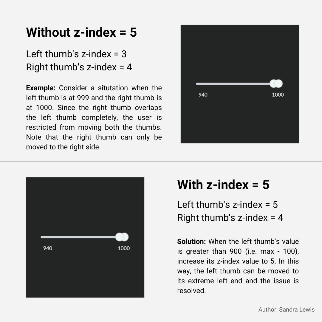
The class thumb--zindex-5 is conditionally applied to the left thumb to be able to move the thumb from the extreme right end. The image shown below explains this more clearly.
Changing the Range Width
We first need to access the <div className="slider__range" /> in order to change its width. React's useRef hook will help us achieve this.
// Create a ref
const range = useRef(null);

// Attach the ref
<div ref={range} className="slider__range" />
Whenever the minVal and maxVal state variables change, our component needs to re-render and decrease or increase the width of the range accordingly. We will use the useEffect hook to accomplish this.
import { useCallback, useEffect } from "react";

// Convert to percentage
  const getPercent = useCallback(
    (value) => Math.round(((value - min) / (max - min)) * 100), [min, max]);

// Set width of the range to decrease from the left side
useEffect(() => {
  if (maxValRef.current) {
    const minPercent = getPercent(minVal);
    const maxPercent = getPercent(+maxValRef.current.value);

    if (range.current) {
      range.current.style.left = `${minPercent}%`;
      range.current.style.width = `${maxPercent - minPercent}%`;
    }
  }
}, [minVal, getPercent]);

// Set width of the range to decrease from the right side
useEffect(() => {
  if (minValRef.current) {
    const minPercent = getPercent(+minValRef.current.value);
    const maxPercent = getPercent(maxVal);

    if (range.current) {
     range.current.style.width = `${maxPercent - minPercent}%`;
    }
  }
}, [maxVal, getPercent]);

// Get min and max values when their state changes
useEffect(() => {
    onChange({ min: minVal, max: maxVal });
}, [minVal, maxVal, onChange]);
In the first useEffect hook, maxValRef.current.value is used instead of the state variable maxVal because we only need the range width to change when minVal changes. If maxVal was used, ESLint would throw a warning asking us to include it in the dependency array since it is a state variable and not a reference variable.
By default, the width of any div tag would decrease or increase from the right side. To reverse this functionality, we use the left property in CSS in the first useEffect hook.
Displaying the Range Values
Let's create two more divs to display minVal and maxVal. Place them after <div ref={range} className="slider__range" />.
<div className="slider__left-value">{minVal}</div>
<div className="slider__right-value">{maxVal}</div>
Add the required CSS to the multiRangeSlider.css file.
.slider__left-value,
.slider__right-value {
  color: #dee2e6;
  font-size: 12px;
  margin-top: 20px;
  position: absolute;
}

.slider__left-value {
  left: 6px;
}

.slider__right-value {
  right: -4px;
}
And that's all the code you need to build the MultiRangeSlider component.
Use the component in the App.js file and set the min and max values.
 <MultiRangeSlider
     min={0}
     max={1000}
     onChange={({ min, max }) => console.log(`min = ${min}, max = ${max}`)}
 />
We now have a multi-range slider built from scratch without using a library!
For all the TypeScript fans out there, here's the link to the TypeScript version: Multi-Range Slider (TypeScript)
Thanks for giving it a read.
Happy coding!